Strength in Contrast
"Flow" is the product of collaborative duo Jacob Steed and Canaan Casteel. The two met while working together in the UT Arlington Glass program, then later decided to bring their individual strengths of neon and clay together to form their first work revolving around the contrasting natures of neon and clay. They are currently working and designing more work that features different aspects such as suspended clay, geometric design, glazing clay, and plasma integration.
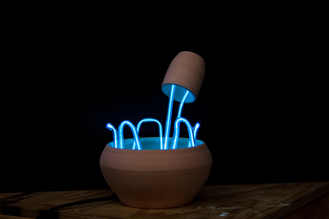
Flow
H 10" x W 8" x D 8"
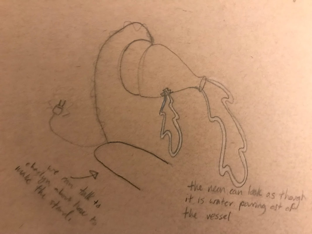
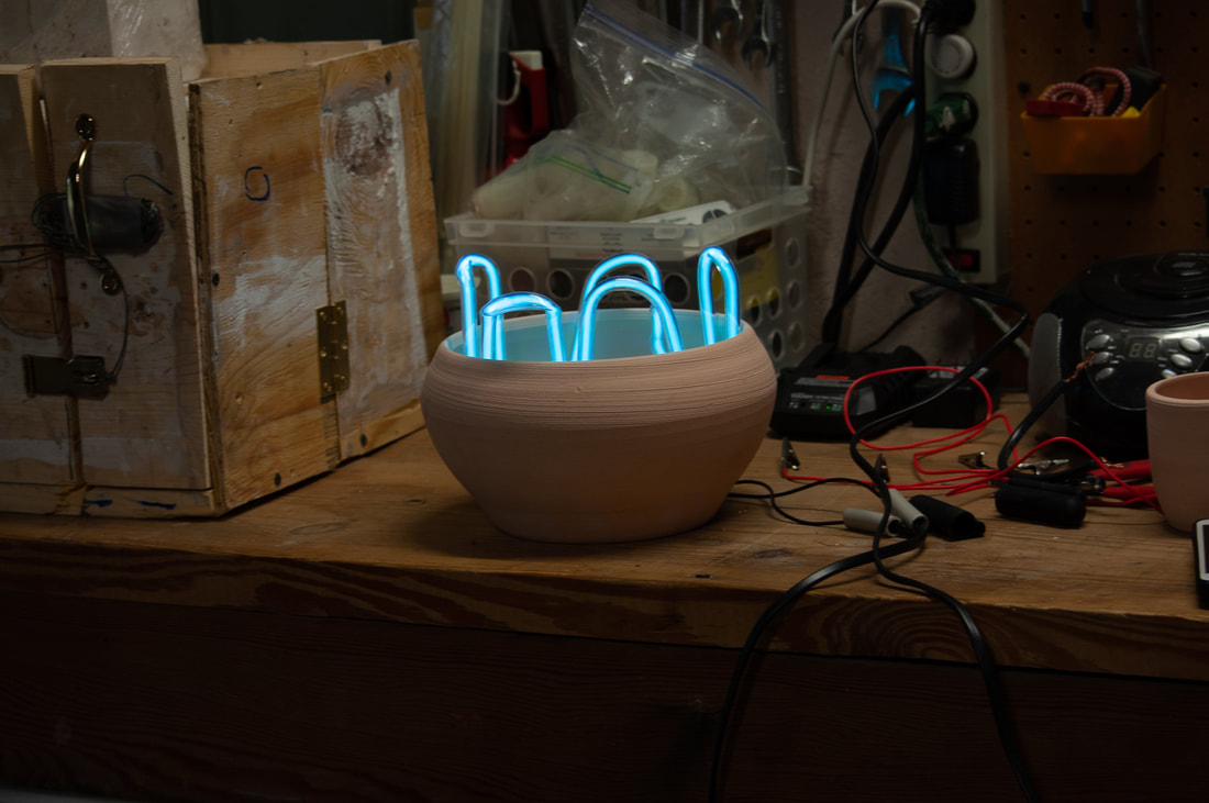
This work was specifically designed to highlight the contrasting nature of neon and clay. The rough texture of the clay directly counters the smooth, soft glow of the blue neon, shown most predominately in the white glow on the inside of both clay vessels. The organic splash of neon directly contradicts not only the mechanical nature that we commonly associate with the material, but also the weight that it must support in order to keep the clay cup afloat. The clay also feeds into this contradiction of material as the seemingly perfect shape and industrial like texture go against the organic, wet material that is formed in the beginning. The soft glow of the neon rest easily on the inside of the clay, allowing the viewer to feel the weightlessness that is portrayed with the suspended cup and the fluid movement of neon.
Process
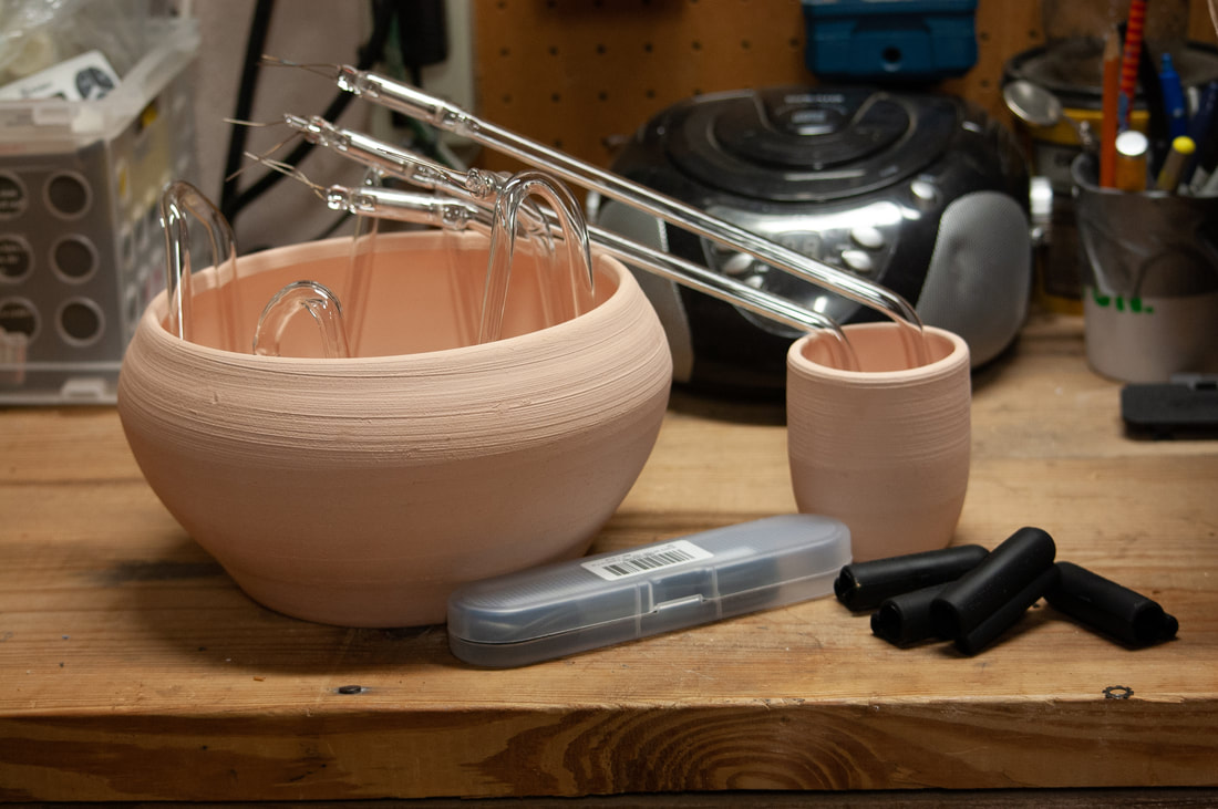
The original design had only one suspend clay vessel that was supported by a metal fixture. After some initial testing, we figured out that the neon could support the weight of a small clay cup, and have all of the wire fully encased within another large vessel. We determined that the best solution was to only have neon and clay in the final design so that the viewer is not distracted by any outside materials that do not directly tie into the contrast between the materials. As we continue to expand upon this initial work, I will upload more process images, final images, and descriptions of the individual works.